Creating reusable components without bloating your design system


We’ve all lived through the Day one design system delusion. Everything is pristine. A couple of buttons, a neat little card, and Auto Layout is behaving itself perfectly.
Then reality hits.
Marketing needs a badge on the promo blocks. Product wants an icon on the right side of the list. A stakeholder decides images are optional this week. Before you know it, you’re looking at a 64-variant monstrosity that lags your Figma file, confuses your team, and makes developers look at you with pure resentment.
There is a better way. You don’t need a new variant for every single layout permutation - you just need components that actually know how to adapt. Here is how to build lean, flexible UI components using the actual doings in Figma.
The variant trap and when to walk away
Variants are brilliant for states. Think hover, focused, disabled, or pressed. They are absolute overkill for layout changes. If you are creating a brand-new variant just to hide a button or shift an icon, you are essentially vandalising your own library.
Instead of building a rigid block, we need to treat components like smart containers. When you combine Auto Layout with Figma’s native component properties, a single master component can do the heavy lifting of dozens.
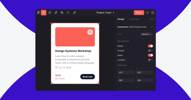
Turning the design panel into a remote control
Nobody enjoys digging through fifteen layers of nested groups just to turn off an arrow. It is tedious and unnecessary. Instead, you can bring that control straight to Figma’s right-hand sidebar using component properties. Think of it as a remote control for your layout.
Boolean properties act as your toggles and handle the basic on-off choices. If a card needs a badge today, toggle it on. If marketing says the image is overkill for a tight grid, toggle it off. Thanks to Auto Layout, the rest of the component just snaps into place without breaking.
Instance swap deals with the dropdowns. You really do not need a separate variant frame for every icon combination in your ecosystem. Use instance swaps to let designers pick from a curated list of icons or avatars right from the sidebar in two clicks.
Text properties bring copy editing to the top level. This lets designers update headlines and body text directly from the panel. It completely stops people from double-clicking too deep and accidentally ruining the spacing logic inside the master component.
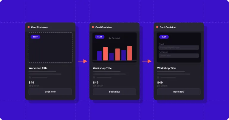
Figma slots are your safety valve
Even with the cleanest properties, someone is eventually going to throw a curveball your component cannot handle, like shoving a custom pricing table or a unique video player inside a standard modal. This is where slot components save your sanity. A slot is just a blank, structural placeholder nested inside a main component wrapper.
To make this work, you first build the skeleton, a standard modal wrapper with a header and a close button. In the middle, instead of locking down a rigid layout, you drop in an instance of a blank slot component. When another designer pulls that modal into their local file, they simply use an instance swap to replace that blank space with whatever custom layout they just invented.
The parent wrapper still dictates the global padding, background colour, and responsive behaviour, but the local file gets total freedom over the contents. You get consistency, they get flexibility, and the global library stays completely clean.
Building things the way developers actually write code
The best part about stripping back your variants is that it aligns perfectly with how frontend developers actually work. Developers do not build fifty separate components for fifty minor layout tweaks. They build one component and use props to pass data, toggle elements, or inject children via slots.
By structuring your Figma files with that exact same intent, you are not just saving yourself from library bloat, you are finally speaking the same language as developers. It makes handoff feel less like a chaotic negotiation and more like a proper collaboration.
The best design systems are not the ones with the most components. They are the ones that solve the most problems with the fewest.

About the author
Gregory is happiest when he's solving design problems. From obsessing over spacing and typography to crafting scalable design systems, he loves finding elegant solutions that make digital products simpler and more intuitive.
A firm believer that great design should work for everyone, Gregory is passionate about accessibility, collaboration, and creating experiences that users genuinely enjoy.
How can we help?
-
Responsive Design Beyond Breakpoints: Just Because It Scales Doesn’t Mean It Works
Responsive design should …
-
Why We Need Agile Delivery More Than Ever
AI lowers the cost of bui…
-
User Research Isn't a Luxury. It's How You Get the Results You Need.
User research isn't a lux…
-
Digital Degradation: What it is and How to Prevent it
A UX audit reveals the sm…


