Responsive Design Beyond Breakpoints: Just Because It Scales Doesn’t Mean It Works


Let's be honest; almost every website looks "fine" on a phone these days. You open a link, the columns stack nicely into a single line, the text stays inside the margins, and nothing violently spills off the edge of the screen.
Technically, it’s responsive. But ask yourself; is it actually nice to use? Or do you just tolerate it because you’ve lowered your expectations for the mobile web to the absolute floor?
There’s a massive gap between a layout that doesn't break and an experience that actually works. Making things shrink is easy no, modern CSS and design tools basically do it for us. The real challenge isn't fluidly reflowing pixels anymore. It's making sure a page doesn't become deeply, profoundly annoying the second it gets squeezed onto a smaller screen.
The Lazy "Just Stack It" Approach
The default move for most responsive design is incredibly simple: take a three-column desktop layout and stack it vertically on mobile. It keeps the text readable, sure, but it completely wrecks the logic of the page.
Take a classic product comparison page. On a laptop, you look left-to-right and instantly see which subscription plan has which features. On a phone, that table blindly stacks into a 50-foot-long scrolling nightmare. By the time you scroll down to look at Option C, you’ve completely forgotten what Option A even offered, and you're contemplating just closing the tab and living without the software entirely.
Another classic culprit is the alternating zig-zag layout (image on the left, text on the right, then vice versa). When it stacks automatically on mobile, you often end up with an awkward "image-text-text-image" pattern that makes it look like your CSS gave up halfway through loading.
The reality is, we can't just let content stack passively. Sometimes a mobile view needs a totally different interface patter, like turning a massive comparison table into a swipeable card carousel or a simple tabbed view, rather than a test of physical endurance for the user's thumb.
Fingers Aren't Mice
Pixels scale down smoothly, but human hands don’t. A huge percentage of mobile frustration comes from forcing desktop habits onto touch screens and hoping for the best.
The Hover Trap: The desktop web loves hover states. Hover to see a tooltip, hover to reveal a dropdown menu, hover to see a button. On a phone, hover doesn't exist. If you hide important stuff behind a hover state, your mobile users are just going to aggressively tap their screens, look like they're angry-texting, and eventually leave.
Fat-Finger Syndrome: A tiny 14px text link is easy to click with a precise laser-guided mouse pointer. On a phone, it's a mis-click trap. If your "Delete Account" button is sitting 2 pixels away from your "Save Changes" button, you’re playing a dangerous game.
Keyboard Chaos: A form with ten fields feels manageable on a 27-inch monitor. On a phone, the moment the digital keyboard pops up, it swallows half the viewport. If you haven't accounted for that cramped space, filling out a form feels less like navigating an interface and more like looking at the world through a submarine periscope.
Figma vs. The Real World (and AI Layouts)
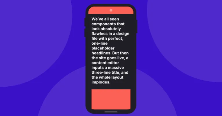
We’ve all seen components that look absolutely flawless in a design file with perfect, one-line placeholder headlines. But then the site goes live, a content editor inputs a massive three-line title, and the whole layout implodes. On mobile, that single component now takes up the entire screen, and your beautiful design looks like a digital pile-up.
We’re seeing a similar issue with AI-generated layouts. AI design tools are great at looking at a desktop page and instantly spitting out a mobile version that matches the colors and fonts.
But AI doesn't actually use websites. It will happily shrink a complex data chart to fit a phone screen, not realising that the labels are now a completely unreadable 3px font, or that a human finger can't possibly tap on a specific bar in the graph without clicking three others. It fixes the visuals, but kills the utility. It's the design equivalent of "looks good from my house."
Zooming in is Just Mobile for Desktop
We usually talk about responsive design as "Desktop vs. Mobile," as if they're two entirely different species. But it’s also a massive part of basic accessibility.
A lot of people with low vision zoom their desktop browsers up to 300% or 400% just to read the text. When they do that, the browser forces the website into its mobile layout to keep it on the screen.
If your team treats the mobile version as a "stripped-back" site, hiding secondary features, navigation links, or tools just to make the phone view look clean and minimalist, you are accidentally hiding those features from desktop users who just need larger text. Clean design shouldn't come at the cost of actual usability.
How to Test if it Actually Works
Before launching a responsive page, stop looking at the screen widths in your browser's developer tools and ask a few real-world questions:
Can I use this with one thumb while holding a coffee? Try navigating the mobile version while walking. If you need surgical precision and absolute silence to hit a button, it's broken.
Did we hide the good stuff? Are we cutting features on mobile just because we couldn't figure out where to put them, or because we're hoping mobile users just don't want to do anything complex?
Will it survive ugly content? If a client writes a paragraph where a short sentence should be, does the mobile layout still hold up, or does it throw a tantrum?
Responsive design was never about making things smaller. It's about making sure a website is just as easy to use on a crowded subway train as it is at a dual-monitor office desk.

About the author
Gregory is happiest when he's solving design problems. From obsessing over spacing and typography to crafting scalable design systems, he loves finding elegant solutions that make digital products simpler and more intuitive.
A firm believer that great design should work for everyone, Gregory is passionate about accessibility, collaboration, and creating experiences that users genuinely enjoy.
How can we help?
-
Why We Need Agile Delivery More Than Ever
AI lowers the cost of bui…
-
Creating reusable components without bloating your design system
Reduce design system bloa…
-
User Research Isn't a Luxury. It's How You Get the Results You Need.
User research isn't a lux…
-
Digital Degradation: What it is and How to Prevent it
A UX audit reveals the sm…


