Exploring design innovation in a tourism website

In this article we will explore the site and how its execution is something to be admired from a design perspective. Then we will look at its function and how effective the site might be in driving tourism.
Design and navigation
The immaculate design and navigation achieves an impressive sense of natural beauty through its attention to clean layout in a modern style. It's a bold step away from the more corporate, almost templated feel that we are used to.
The first and most noticeable difference is the main navigation on the left, main content area filling the screen with large imagery on the right. This strikes an immediate contrast to many of the tourism sites - which stick with a more traditional top navigation, and large horizontal hero.
Rather than scroll down to reveal content, scrolling down on the homepage cycles through the main website sections - as listed in the left menu. This is an innovative alternative to a carousel, although we think works better than a carousel because it's function is a more purposeful navigation through content that relates to the menu. Each option is presented in the main content area with text transition and impactful headline, complemented by dramatic imagery behind and revealing subtitle.
Sub-category pages feature an arrow to highlight the call to action. When scrolling on the selected section, the arrow becomes encircled with a progress bar. This is a nice touch to indicate the progress of the scroll in the article.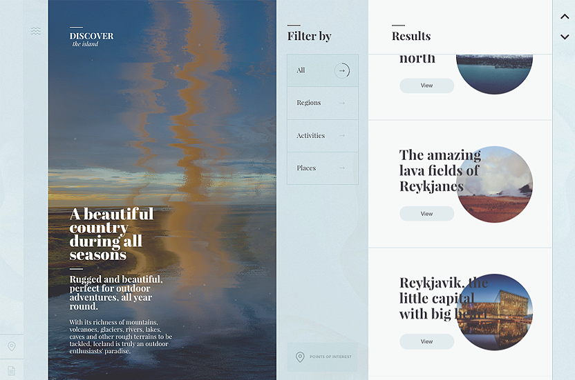
Selecting a section doesn't give you a standard page navigation, instead it transitions to introduce content from the right - giving a real sense of left to right progression - as if you are exploring deeper in the content. It was described in one of our design workshops as "though you are turning the page, almost a magazine-like experience". Clicking deeper into the site reveals elegantly curated content that has been selectively placed with alternate links and consistently stylised imagery. From the content pages you are either handed-off to external sites, enticed to explore more content, or navigate back from where you came.
Content
The main content of the site is carefully selected to offer highlighted attractions, and exploration - backed up by the dramatic imagery. The concise language details what’s on offer and gives a clear indication of the top-level detail required for inspiration. The serif font is used consistently throughout and to us it conveys culture and heritage - especially with the use of large and impactful titles. The language used is easy to read, though marginally challenged by the serif font. Its amongst the words where the target audience of the site becomes clear- it's not for everyone. There is a specialist profile being targeted - they are actively seeking a unique experience that is not a common path trodden by everyday tourists.
Animation
In keeping with the single page implementation the site does an excellent job of animating - using a mixture of subtle effects and transitions. If you look closely at the imagery on the homepage you will notice a subtle particle effect which helps to bring the images 'alive' in a subtle manner. We really feel this 'life' helps to add an atmosphere and ambience to the pages.
Following every click the page layout glides into place with a controlled motion. If there was one criticism we would say this can feel frustrating at times because the slow animation makes the site feel a bit delayed. However we appreciate the sense of control the animation gives, and it emulates a purposeful engagement with each click.
User experience and usability
The many subtle nuances of the site help to really engage you with the site. This is not a site to be quickly browsed, it is more to be explored and experienced. It will appeal to users well versed in design, culture, exploration and heritage that want to enjoy the many unique sights and experiences Iceland has to offer.
There is a noticeable absence of responsiveness with the site, however the mobile device experience is where this site truly excels. Navigating through the pages is a seamless experience, each page transitions to the next to give a fully engaging app-like interaction. The transitions here are smooth and allow for a quicker page navigation without a page reload which feels refreshing in a website.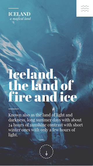
Accessibility opens a huge debate with innovative and creative projects such as this. All websites should be built with inclusive design by default. Some future considerations could range from including the default tab highlight in the experience and adding progressive enhancement to ensure non-javascript browsers can still access the content. Accessibility is a huge conversation, and one that is now providing a competitive advantage by many industry leaders - something I will save for blog post at a later date.
Overall the experience is engaging, but we have some reservations about the proposition itself. It certainly does a superb job of promoting the subject as a beautifully designed and developed website, but how does it drive tourism over and above inspiration? It will be interesting to watch to see how the site evolves. Perhaps it might choose to connect to social channels that drive complementary stories of travellers in Iceland, or look at suggesting exploration through curated Icelandic adventures.
Wrapping up
The site's main selling point is its high fidelity design, with attention to detail - where the single page application immerses the user in the experience without one single page reload. The modern and clean design helps to really contrast with the natural, rugged feel of the imagery - making it really stand out. The unique navigation keeps you engaged with the site because the signposting is effective in aiding the user to know where they are, with simple steps to find your way.
When we first visited the site we were impressed by the design and finishing touches, however we were uncertain of its purpose. We wondered what everyday users would think and how they would interact. Exploring the site and reading the content we began to realise the purpose is a more specific target market. It would be interesting to see how the site is performing with users, how they engage and if the inspiration triggers their next move to visit Iceland.
The site comes across as a micro-site that aims to associate a beautiful and rugged feel of the outdoor exploration on offer in Iceland. It's really effective in giving a glimpse of what Iceland has to offer. We were drawn to the site because of the level of design fidelity, hidden subtleties and unique approach. It appears to be a commission in conjunction with Promote Iceland and it was awarded Site of the Day by Awwwards - credit has to be given to the web design agency for their impressive work.
Related links:
- Love for Iceland: loveforiceland.com
- Promote Iceland: http://www.islandsstofa.is/en/about/
- Design and development credits: http://www.veintidosgrados.com/
- Awwwards article: https://www.awwwards.com/sites/love-for-iceland
- Further inspiration from Awwwards: https://www.awwwards.com/20-tourism-sites-for-your-inspiration.html